I Am


About Me
I love
Hi friends! My name is Joshua Magno, and I’m a graphic designer, an art director, and an illustrator. I’ve been a professional in the design world for 10+ years and have been drawing for even longer. Even through all these years I can honestly say that my passion still burns, because I just love to create. I always strive for greatness at any endeavor, and always seeking to improve my craft. Creating is something I can do for the rest of my life, and my dream is to be one of the greatest artists in the world, and inspire other aspiring designers and artists out there. I believe that the world needs more art and creativity and would be a much better place if there was more of it.
-
 joshuamagno23@gmail.com
Skills
That pays the bills-

Layout
To be able to create order from chaos and to lead the viewers eyes is a storytelling artform in itself, by utilizing contrast and negative space. What designer doesn’t love negative space?
-

Problem Solving
The ability to work proactively and independently to achieve the goal intended, sometimes by finding innovative solutions or through compromise.
-

Communication
You can't do everything alone. I believe in teamwork and that everyone plays a role for the greater good. And that is where clear communication becomes important.
-

Adobe Creative Suite
Proficient in all the major Adobe programs: Photoshop, Illustrator, InDesign, Dreamweaver and Premiere.
-

Web and Video
Complimentary skills in HTML coding and Video editing. My passion for video editing is slowly growing and has been another refreshing outlet of creativity for me.
-

Illustration
A life long hobby that has stuck with me through thick and thin. I desire to keep growing as well as an artist and will continue to do so for as long as I breathe.
Awesome Stuff
Check out some of my works
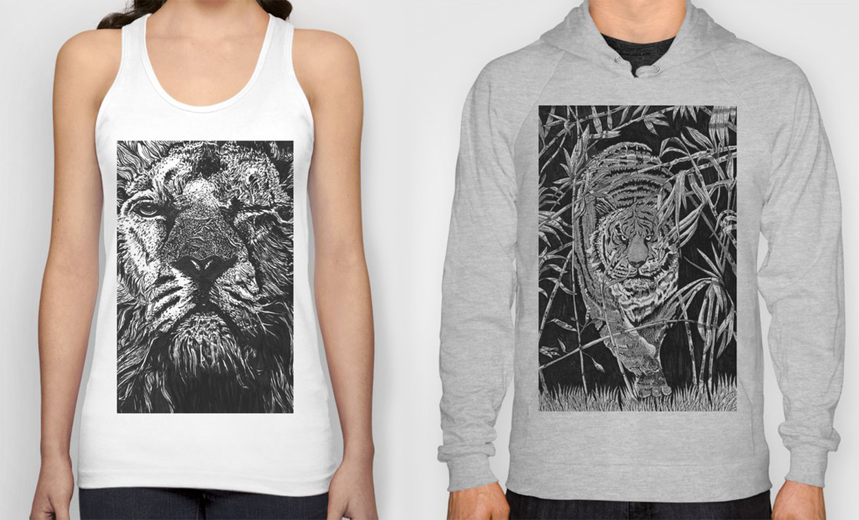
Online Store
Shop merchandise designed and illustrated by Illusive Curve-
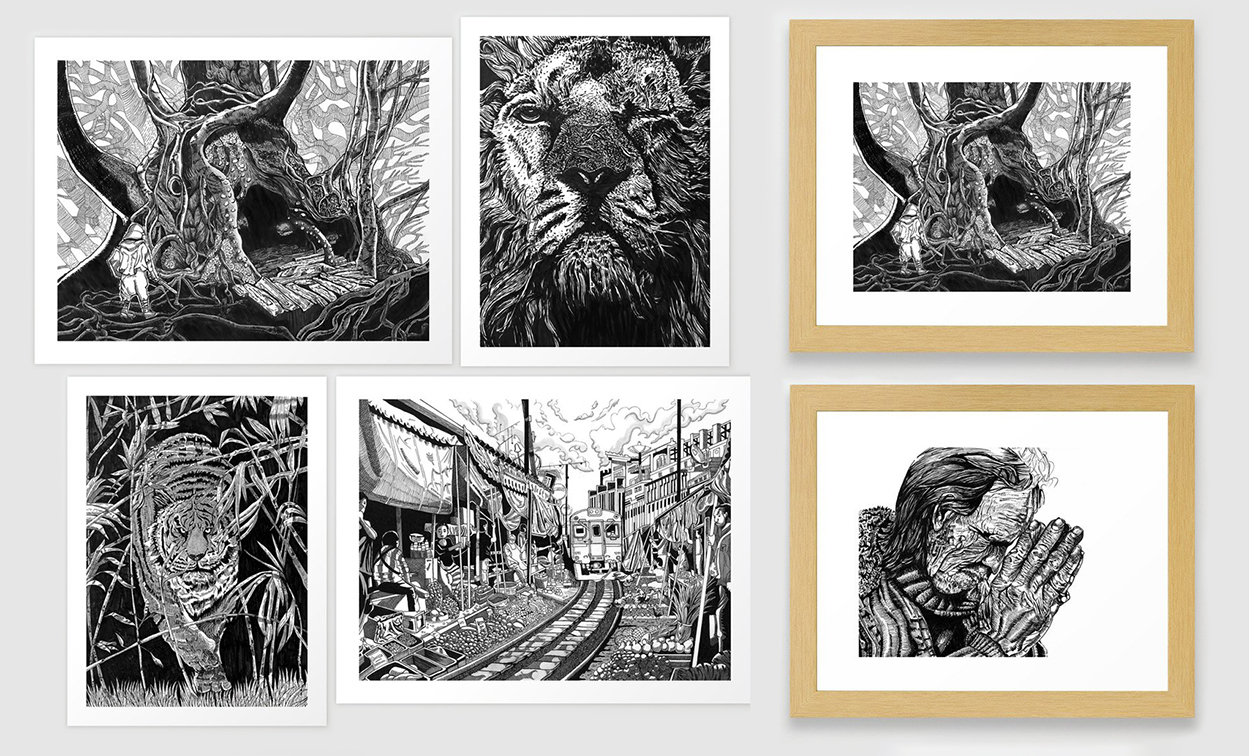
Art Prints, Framed Prints, Canvas Prints
-
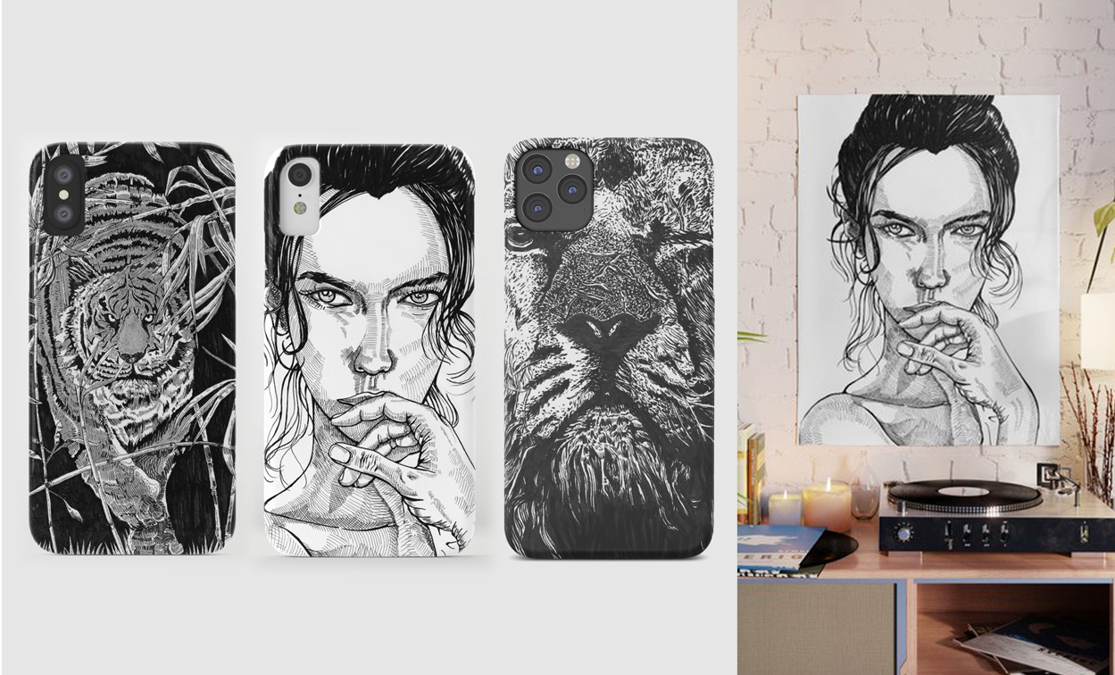
iPhone Cases, Posters, etc.
-
0+
Designs and Illustrations Completed -
0+
Years of Professional Experience -
Fields of Industry worked in
-
0
Happy Clients
Articles
What's on my mind-


February 21, 2019: Graphic Design
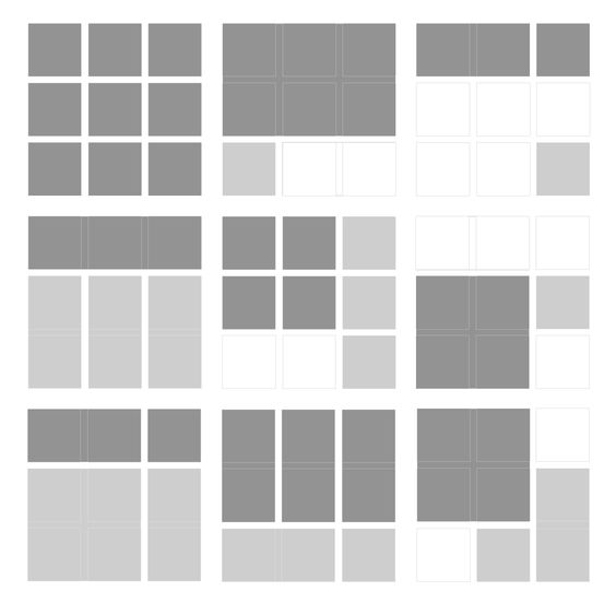
One of the most important fundamental principles of graphic design is to know how to use grids. Simply put, grids are...
One of the most important fundamental principles of graphic design is to know how to use grids. Simply put, grids are a series of vertical and horizontal lines, which vary in size and shape. They can be simple or complex, depending on the designer and the content. Grids are the structural force behind the design. Think of them essentially as skeletons that hold up the piece as a whole. Grids allow the design to maintain organization, and enable visual connections.
Now let’s take a look at a brochure design that I created. Pretty much a simple and solid looking design. Clean looking. Gets to the point. Not too many bells and whistles.

Now let’s look at it from another point of view. We can see that underneath the design, lies the hidden bones that pieces the design together. I placed the text and images, in a way to create an invisible line, and in turn creating rhythm and harmony, giving the whole piece its fundamental structure. We know that there are 3 columns on this brochure even though we don’t perceive actual lines separating them. Essentially, it’s the negative space (the blank space that surrounds the image and text) that produces the grid lines. This subtle way of creating structure not only generates organization but is very pleasing to the eye. Our eyes gravitate towards organization and structure. We don’t want to waste precious seconds of our life looking at messy and ugly things.
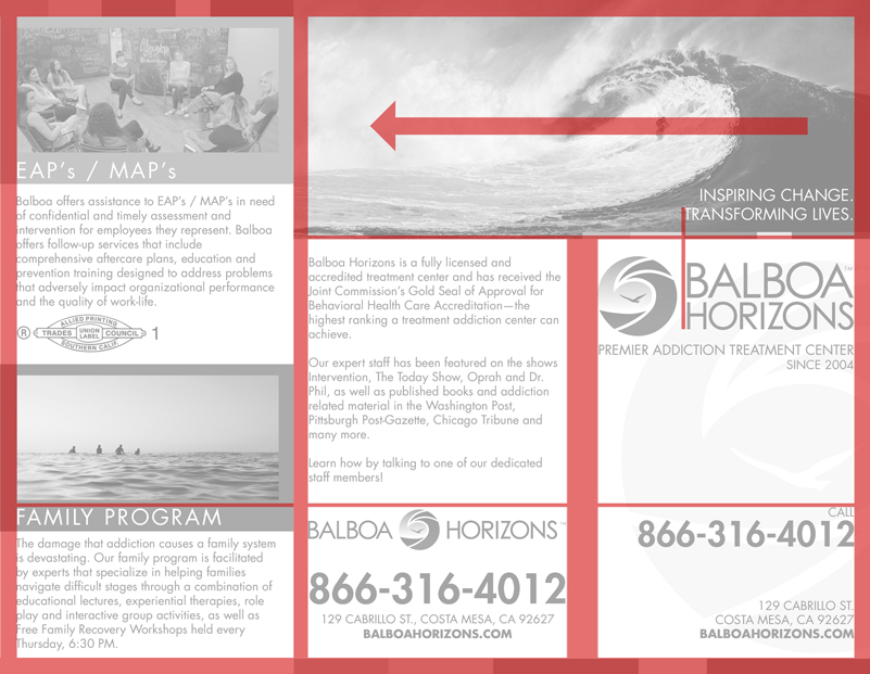
Additionally, with it being a trifold brochure, the first page seen is the column all the way to the right. And then when opened from right to left, the image of the surfer riding the wave, continues on to the middle column, creating a nice flow. I opted to break the grid structure in this area, instead to create a dynamic flow with the middle and right column. This tells us that we’re not always confined to the rules, and they can be intelligently broken as long as they’re appropriate.
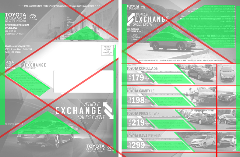
Here’s another design that I made, a presentation folder used for an auto dealership. In this instance, we can actually detect the grid lines themselves. Only this time around, they are rotated diagonally instead of going straight up and down or left to right, creating an “X” like shape across the whole piece. The diagonal grid creates a very dynamic feel to the design that evokes speed and action, very much complimenting the fast moving cars that are used for the imagery.
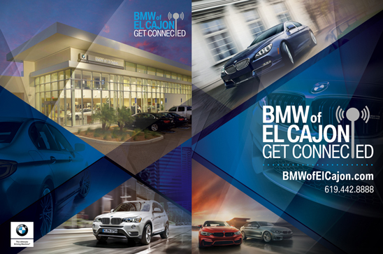
Again, let’s take a look at this design more closely. We know that the brochure from the last example used text placement as the tools to create the grid layout. But in this design, where there is very little text to be utilized, the designer, opted to use the images themselves to compliment the shape of the grid. You can tell that each image used was very carefully chosen to accentuate the visible grid. Each shape and outline of the car (even the building) closely parallels the angle of an accompanying red line that is within its proximity. One image was even rotated just to parallel an angle. This gives the whole piece a continuous and harmonious look, where the images are flowing nicely not breaking any sort of rhythm. If I decided to haphazardly chose to place random car images that doesn’t pertain to the angles of the grid, the whole piece would look sloppy.
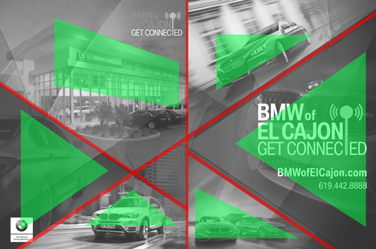
Let’s take a look at one last design. This is a direct mail piece and is probably the most complex design of them all. As you can see here, it has a lot more going on in terms of the text and images used. The same diagonal “X” grid is again being utilized, but there is another grid on the same piece, at the bottom right side. So this means that we’re not always confined to just 1 grid for a whole piece.
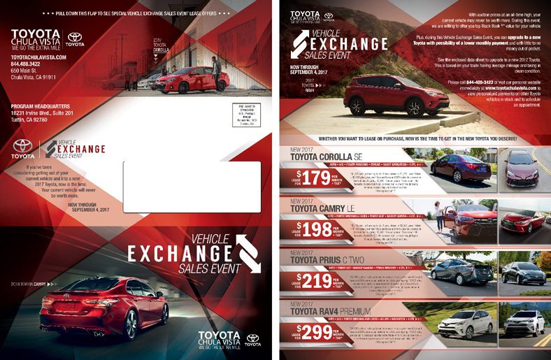
We notice that the designer once again utilized the shape of the cars to compliment the diagonal grid lines. But they also utilized the shapes that the text is creating as well. Almost every visual element has a purpose. Sometimes I went along with the grid sometimes I didn't. But Iam still able to use an overwhelming amount of information and be able to lay them out playfully and dynamically while the structural integrity of the whole piece still stays intact. In this case, I figured out an innovative way to pass on the message to the audience in a creative method, instead of playing it safe.
To conclude, grids are an astounding asset for layout development. Obviously, they are not the definitive and sole factor for a successful design solution. They have to be practiced with acute skill, in conjunction with other design principles such as decisive hierarchy, contrast, typography and image application, and negative space. But a designer can unlock their full potential if they see grids as a tool to create a visual connection rather than being viewed as a restriction.
And with that, let's end things off with a nice meme that only fellow graphic designers will understand (ahem...sympathize).